Have you ever had your jaw dropped while watching a Martin Scorsese or a Tarantino movie? I did.
But my jaw dropped further when I watched a video of a young filmmaking student, Martin Scorsese making a call to India. The call was answered by none other than Satyajit Ray, a filmmaker and a creative genius. Why?
He was India’s first Graphic Designer. You might wonder why he is regarded as the first Graphic Designer in India when there has been historical evidence of the same. He was the first person in India to bring Graphic Design as a profession which is well respected today, one that I am truly proud to be a part of.
This article is inspired by that on the Homegrown website. It mentions Ray’s acumen as a Graphic Designer and how he was employed as a Junior Visualizer in an agency that is now called Ogilvy. But that is not the point.
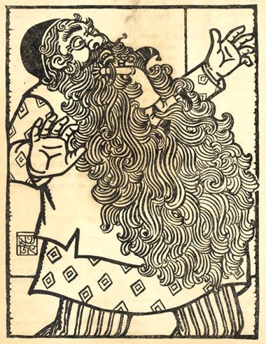
No Satyajit Ray film is complete without his sense of composition cinematically and graphically, but above all, his craze and love for type made us fall in love with it.
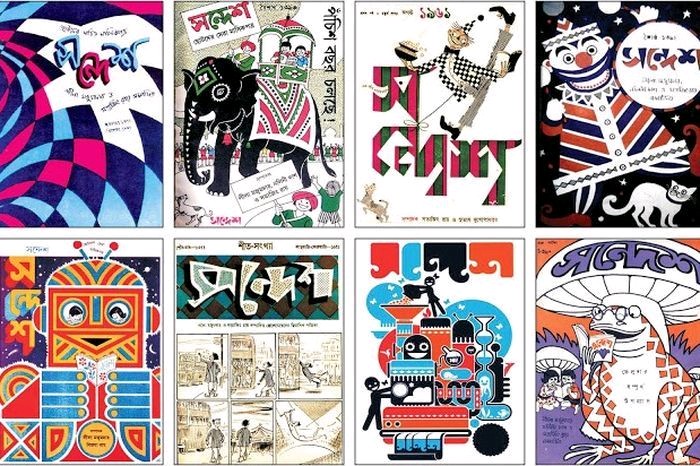
– A wild combination of colours that stood out from each other in a well-defined contrast: Satyajit Ray’s poster design exhibited a wide variety of colour palettes. Perhaps there should have been an art movement termed and dedicated to Ray’s creative philosophy “The Ray Movement”. That would have simply put the Howard Roarks of creativity in a single line.
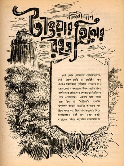
– The type design by Satyajit Ray was a brilliant composition in the study of lines that could simply come together to form a font. The languages up north were written in similar dialects as they were originally etched on wood. Ray brilliantly interpreted the Bengali font with his design style which gave birth to the transformation of Poster making in India.
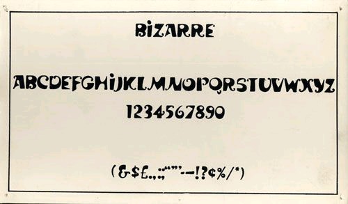
– Ray Bizarre, Ray Roman, Daphnis and Holiday Script were some of his noted fonts. He is also believed to have added additional fonts to the Bengali script, owing to his exposure to Bengali Calligraphy at Tagore’s Shantiniketan. Some of those fonts translated to become logos for noted brands and organizations like Rupa Publishing, Sahitya Akademi, and so on.
How does all of this, inspire me as a graphic designer?
– Typography is one of the predominant areas that I explore as a Graphic Designer. Be it for any purpose: Book cover design or merchandise design, my typography is largely inspired by Satyajit Ray’s colour schemes, and how fonts can be thought of as compositions beyond reading.
– Composition is the biggest takeaway from Ray’s design examples. Symmetry is not textbook, but one that is challenged. Likewise, I tend to play around with composition and symmetry in particular sections, rather than the whole, per the Gestalt concept.
– I incorporate doodles when I am not able to digitally illustrate my visuals. In that way, my designs have a human touch in the final output.
These were some of my takeaways on Satyajit Ray. What are your thoughts on this?
PC: Satyajit Ray website & Homegrown.
Reference Link: Homegrown Article

Leave a comment